Hook
Hook. Line. Sinker.
Hook is a dating app with the primary goal of keeping users feeling safe and secure while on first dates.
Hook has compatibility with three different devices: mobile, smartwatch, and desktop.
With each device catering to specific needs, Hook ensures accessibility and convenience across all platforms, empowering individuals to find meaningful connections wherever they are— safely.
This project presents an approach to solving problems faced during a user’s online dating experience.
My Role
UX Designer & Primary Web Developer
Tools
Figma, HTML, CSS, Bootstrap 4
Timeframe
3 weeks
Problem Overview
Dating apps can be effective to finding your perfect match, but are they safe?
In this new age driven by technology, many of the newest generation have turned to dating apps in hopes of meeting potential partners. However, the anonymity of these apps and the lack of accountability can make them unsafe and even dangerous, leaving users feeling objectified and vulnerable. How can we help mitigate user concerns on various platforms?
The Problem
Creating an app that focuses on additional security features to ensure a safe experience for all users.
To create a safer dating environment for vulnerable users, we designed Hook to include multiple security features to protect users on and offline: ID verification, content consent mode, and escape mode. One aspect of this challenge involved designing solutions not only for mobile platforms but also for smartwatches and desktop computers. Instead of replicating the same design on all platforms, my team and I aimed to integrate and unify the experience across all three. We’ll get into how below!
The Solution
Research
Our approach to comprehending user requirements involved conducting user interviews, administering user surveys, and analyzing competitors.
Our objective was to gain insights into the following areas:
How did previous experience with online dating affect/influence the dating decision-making process?
How do the safety features of an app affect/influence a user?
What thoughts are at the forefront when choosing a dating app?
Primary Research
After collecting user feedback through surveys and in-depth interviews, we structured an affinity diagram, grouping responses into five key categories: Good Dating Experiences, Bad Dating Experiences, App Preferences, Dating Preferences, and Safety Precautions. Notably, a substantial portion of user input emphasized the importance of safety, both on and off dating apps.
Our research shed light on a predominant user concern— safety was a significant concern for users while meeting a potential date for the first time. It was evident that users often relied on friends and family as a means of ensuring their safety during these encounters. Users also showed a preference for dating apps that provided prompts and more details about their potential matches.
Survey & Interview Findings
Insights
“I got many images of male genitalia and lewd acts being performed sometimes without even an opening statement of hello! Just [REDACTED] everywhere without my consent.”
“[My escape plan is to] text a friend ahead of time and agree on an emoji or word for them. If I send them this emoji or word they call me and tell me there’s an emergency and I need to come right away.”
We examined 3 direct and 1 indirect competitor to better understand how Hook can fit into the sphere of online dating.
Upon discovering the key challenges faced by users in the realm of online dating, we conducted an in-depth competitor analysis of Hook's primary direct competitors, which include Tinder, Hinge, and Bumble, as well as indirect competitors such as traditional speed dating and spontaneous in-person meetings. This comprehensive examination allowed us to gain insights into the strengths and weaknesses inherent to each dating method, with a particular focus on safety considerations, whether they be in the digital or physical sphere.
Competitor Analysis
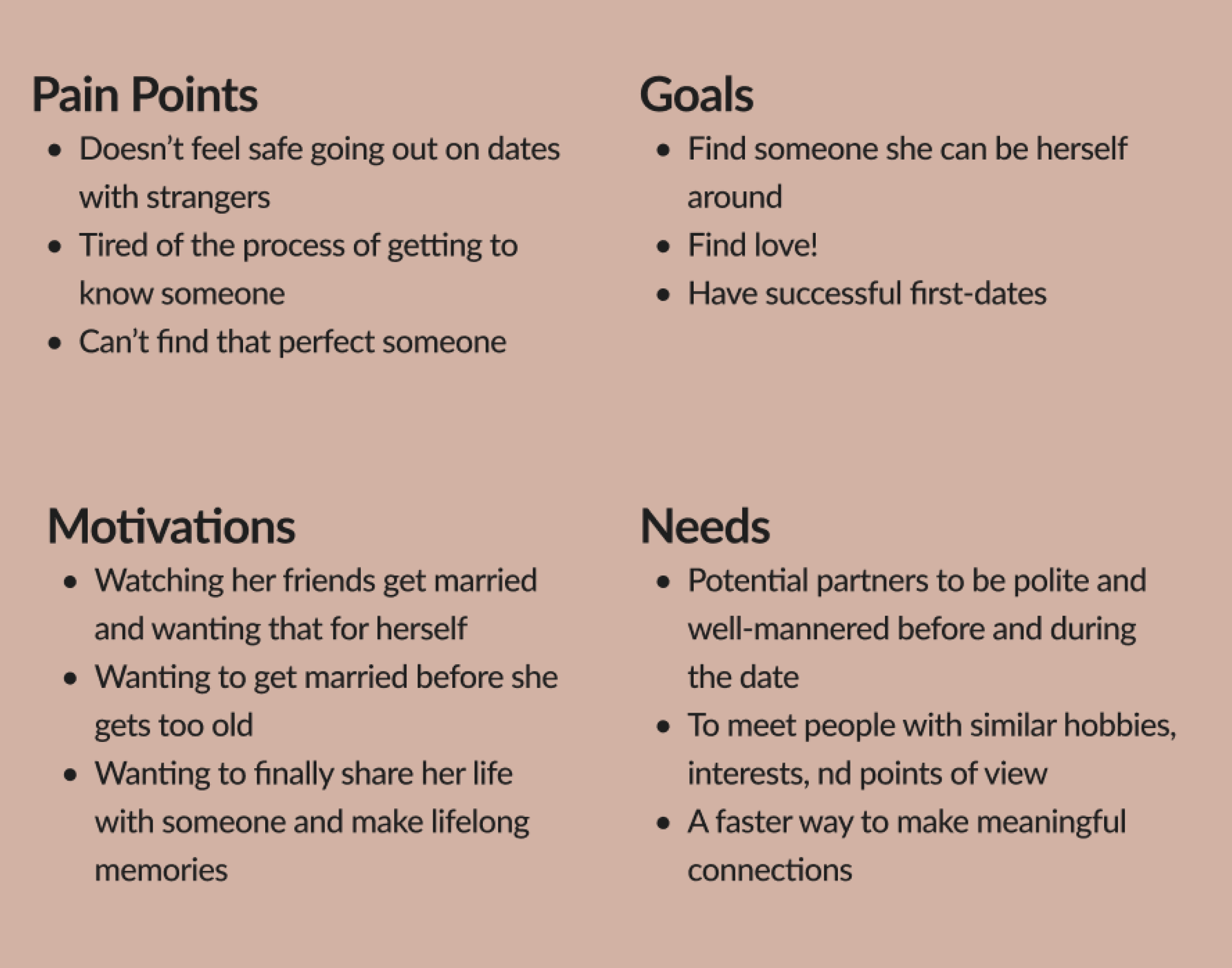
To provide a more insightful view of Hook's primary user base, we've introduced Cara, a user persona crafted from our extensive research. Cara, much like many of the individuals we’d interviewed, has experienced the dating industry's tendency to neglect her safety and overall well-being, particularly online.
User Persona
Define & Ideate
Taking insights and needs from our research and analyses, we began to dig deeper into Cara’s main concerns and how Hook could alleviate them.
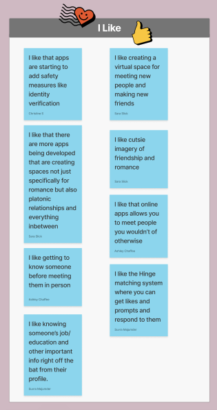
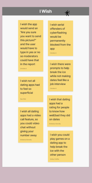
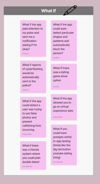
Understanding that effective solutions required a structured approach, we turned to the 'I Like, I Wish, What If?' framework in order to stimulate creative thinking and encourage innovative solutions beyond the conventional boundaries of current dating apps. Using this framework, we engaged in a detailed exploration of Cara’s goals, aspirations, and pain points.
I Like, I Wish, What If?
Following our brainstorming, we created a feature prioritization matrix in order to determine which solutions to focus on.
The ‘I Like, I Wish, What If?’ framework provided us with a large selection of ideas and potential solutions, but we needed to zero in on what was most important to implement. The feature prioritization matrix, in essence, was our compass. It not only directed our attention to the solutions most likely to address Cara's concerns effectively but also ensured that our resources were allocated wisely, providing a structured framework for assessing each idea based on priority, impact, and complexity.
Feature Prioritization
After creating an affinity diagram, we settled on three main features that we wanted to incorporate into our app:
Content Consent Mode: Originating as a way to send adorable baby animal images in response to unwanted photos, it has evolved into a system that enforces consent through extended messaging time and pop-up prompts for photo sharing
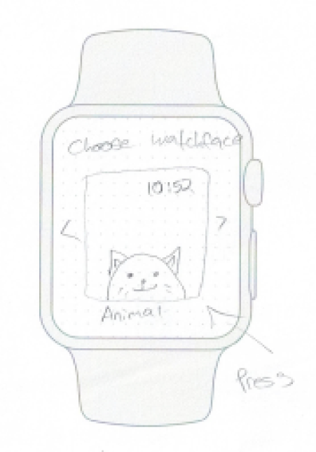
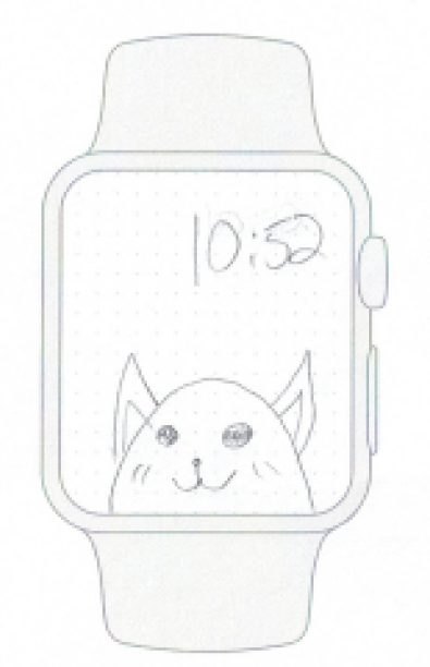
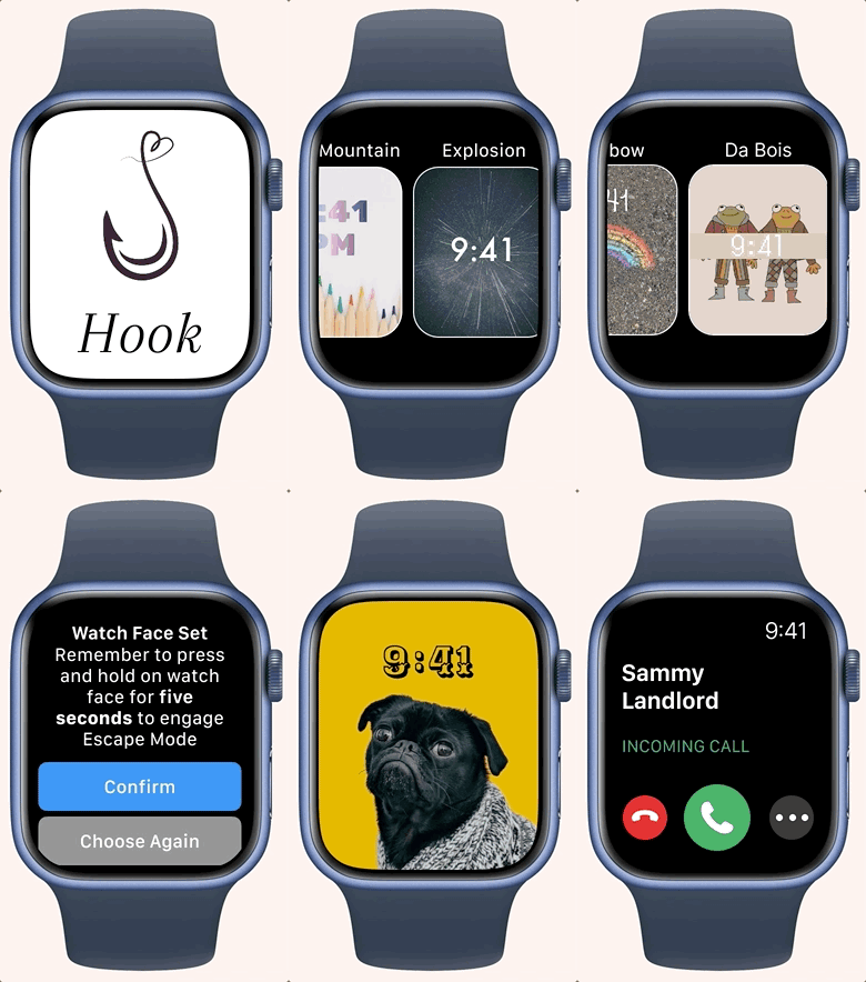
Escape Mode: Users can link their Hook account to their smartwatch, personalize watch faces, and simply long-press the face to initiate a direct phone call, providing a swift exit from an uncomfortable date.
ID Verification: To ensure a secure app environment, it is imperative to conduct thorough user verification. Every user is required to upload a valid photo ID, confirming their age (18+) and verifying they are not repeat offenders.
Implemented Features
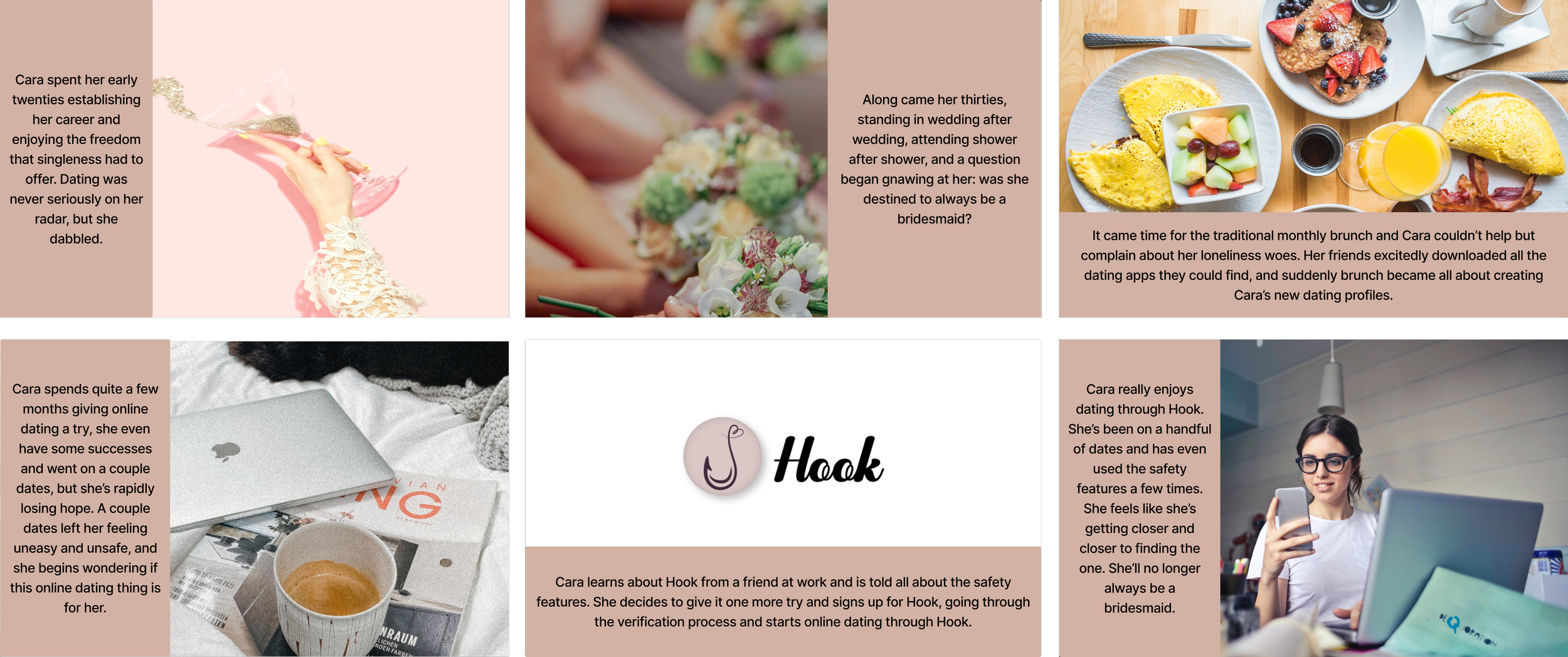
To visualize Hook in the real world, we developed a storyboard to map out Cara’s journey with dating and introduction to Hook.
By mapping out Cara's journey through storyboarding, we were able to place her at the center of the design process, enabling us to empathize with her perspective and tailor to her specific needs and preferences. Moreover, it enabled us to proactively identify and address any potential pain points in her user experience with the app from the outset.
Storyboarding
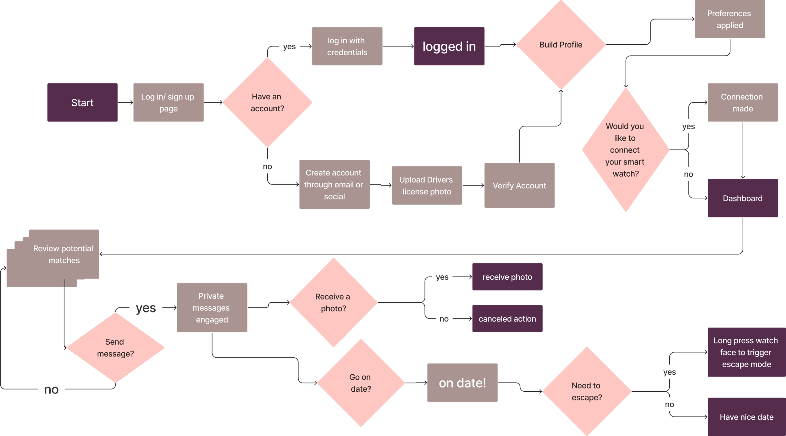
We identified key tasks for the user to complete for the onboarding process, messaging system, and escape mode.
After storyboarding, creating a user flow was the natural next step in our design process for Hook. We broke down each feature (ID Verification, Content Consent Mode, and Escape Mode) into detailed key steps to help define how users like Cara would navigate through the app. First, we identified primary tasks the user would have to complete in order to align with their user goals. Then, we established the specific screens users would need to interact with in order to fulfill those tasks (account creation, smartwatch sync, consent pop-ups, etc.) From there, we were able to create a cohesive user flow to follow the journey a user would take through the app from start to finish.
User Flow
To avoid having carbon copies of the same app, we needed to define distinct primary uses for each device.
While we had clear feature ideas, we aimed for seamless device integration rather than simple reformatting. As a result, we outlined the primary functions for each design:
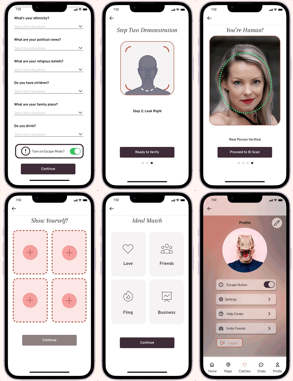
Mobile: Serving as the core user interface, the mobile app encompasses all typical dating app features, including onboarding, profile creation, likes, matching, and direct messaging.
Smartwatch: The smartwatch app focuses on the 'Escape Mode' functionality, prioritizing user safety and convenience.
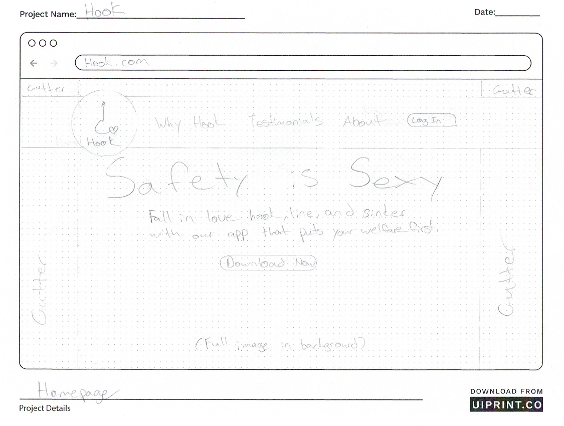
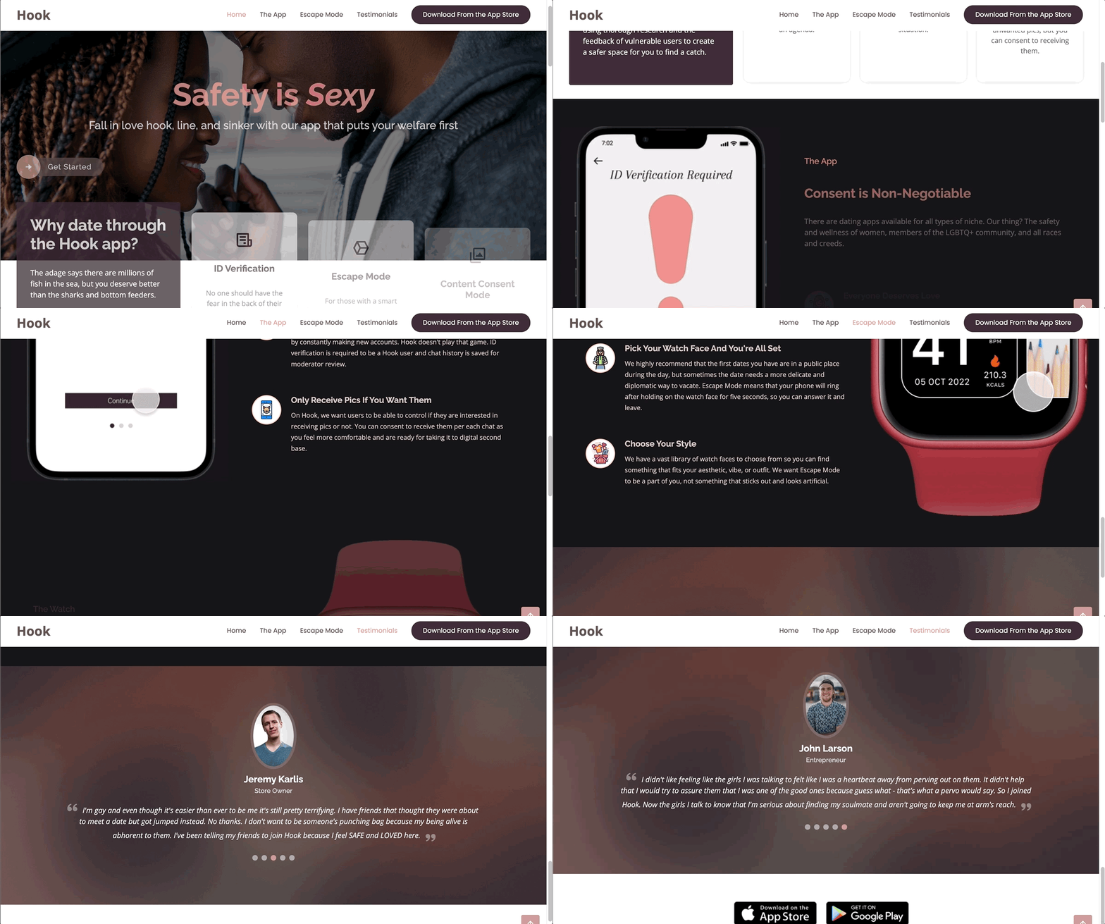
Desktop: Recognizing that most users would primarily rely on the mobile app, the desktop design serves as Hook's homepage, offering users insight into the app, its narrative, and the unique attributes that set Hook apart from competitors.
Defining Hook’s Device-Specific Features
Sketching & Prototyping
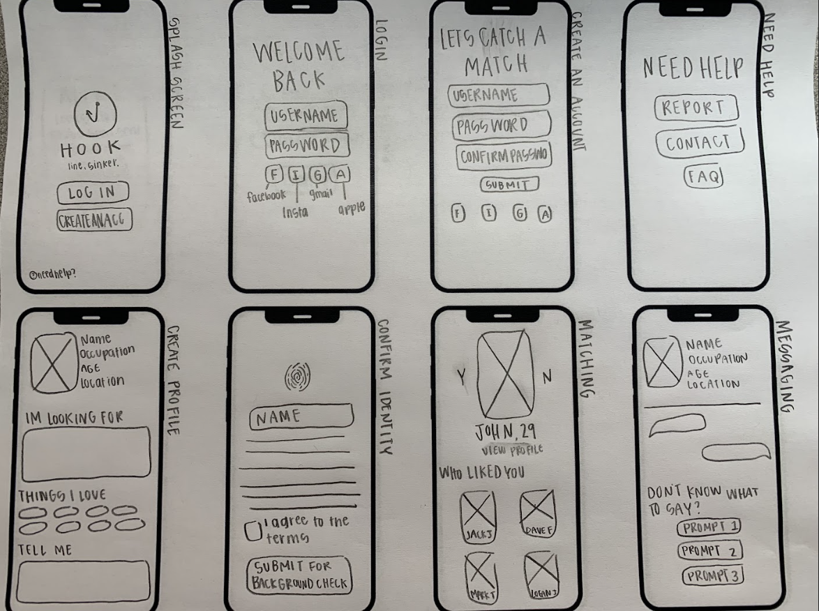
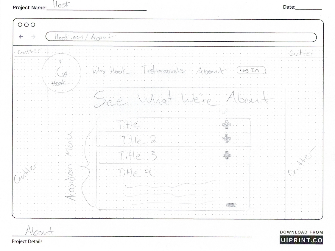
We drafted paper sketches for each device— smartwatch, mobile, and desktop.
With five minds converging on a single idea, it was natural that different visions of the app would emerge. To unify our ideas, each team member created paper sketches for all three devices, and through a collaborative effort, we amalgamated the most promising elements from the sketches into three cohesive and refined final designs (one for each device.)
Lo-Fidelity Sketches
With paper designs finalized, it was finally time to start digital prototyping.
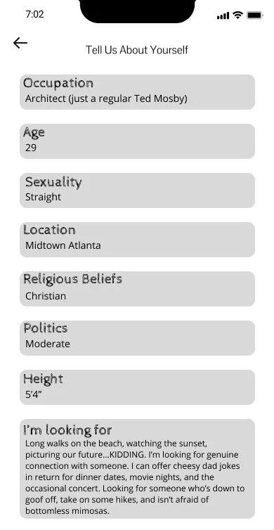
To transition from paper sketches to digital prototypes, my team and I utilized Figma, crafting mid-fidelity designs. We focused primarily on the mobile interface, as it's the central point of interaction for users and where the majority of Hook's functionality resides. Subsequently, we conducted five usability tests on our mid-fi prototype to gather valuable feedback. These tests highlighted areas for improvement, revealed pain points, and validated some of our design decisions.
Mid-Fidelity Prototype
We tasked our users with three key objectives:
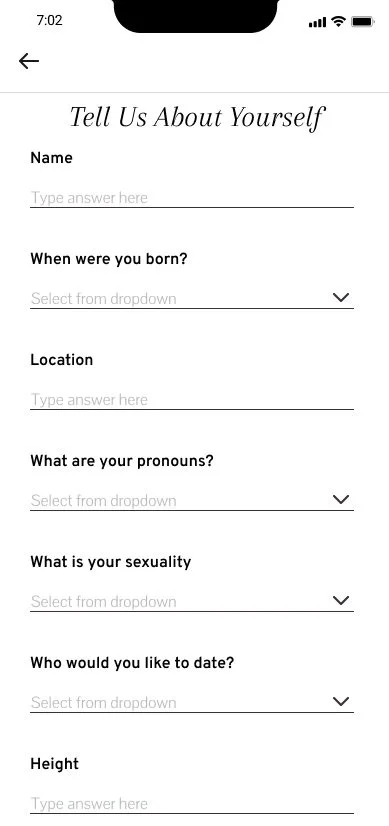
Creating a profile
Resetting their password
Selecting a watch face for the escape mode feature
Key Feedback:
Intuitive interface
Wish there were drop-down menus
With there were more interactions
Incorporating the feedback received, we refined our mid-fidelity prototype to feature enhanced interactivity, including the introduction of drop-down menus and other interactions.
->
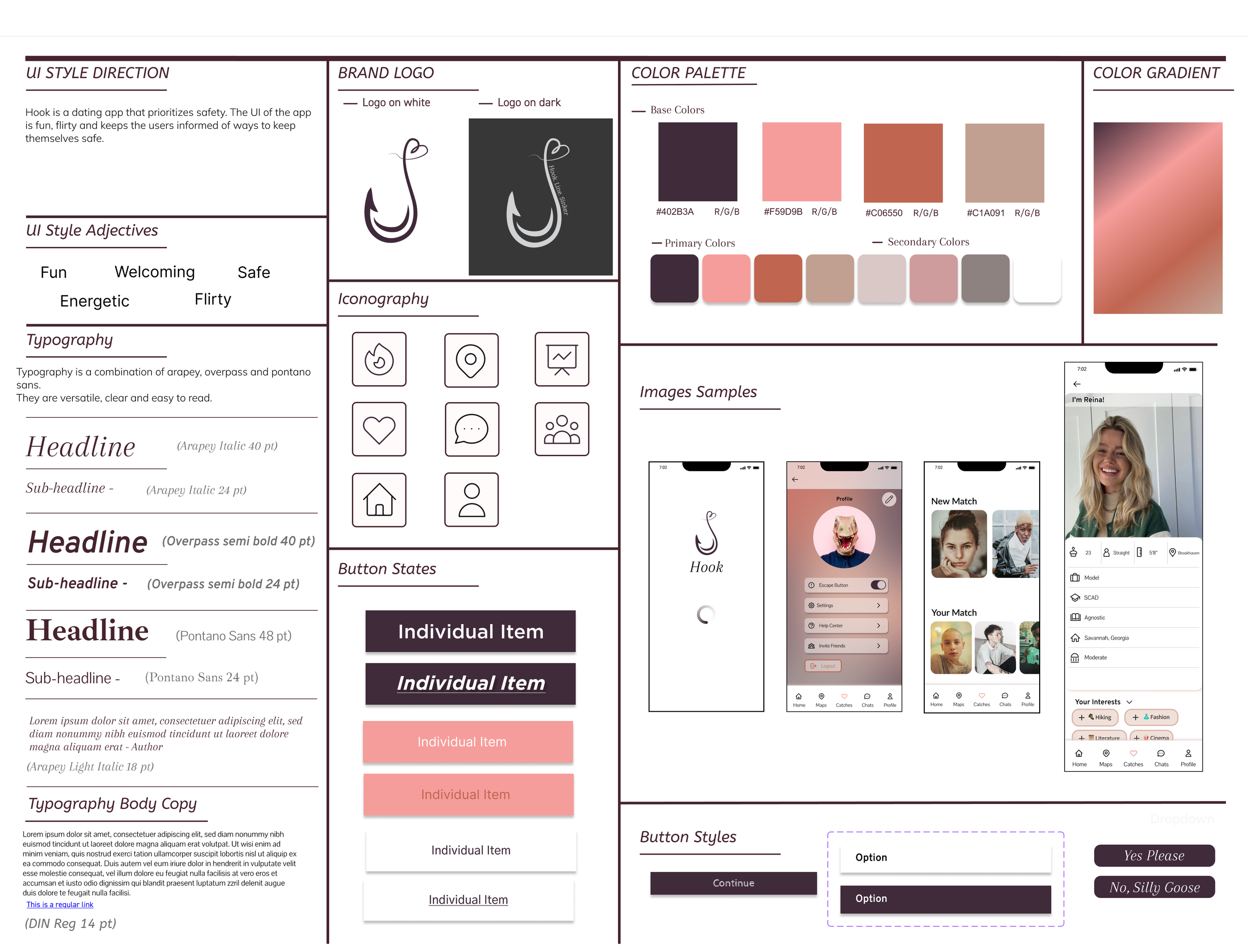
Before implementing color and further edits, it was imperative to define Hook’s branding.
We aimed to create a balance between Hook’s profound mission and user interface. To achieve this, we adopted a natural, flesh-toned color palette and simple, accessible typography.
UI Style Tile
Now that our mobile and smartwatch designs had taken some shape, our attention shifted to the development of Hook's website.
As the sole team member with coding experience, I assumed the role of the primary web developer. My first step was to establish a GitHub Repository, enabling seamless collaboration and robust version control.
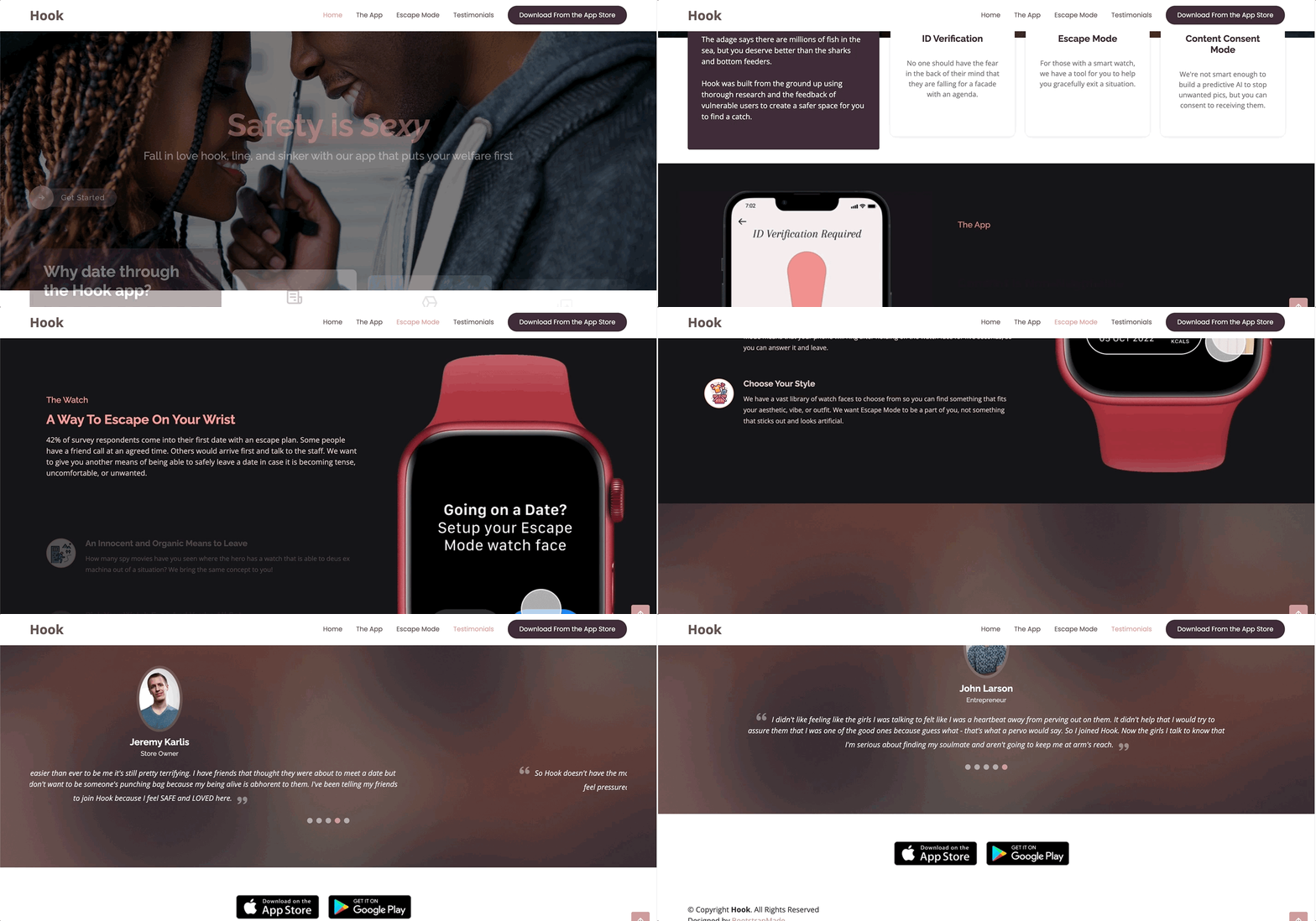
The primary objective of Hook’s website was to create a user-friendly space where visitors could explore Hook’s mission and main features— for this, we wanted the user experience to be exceptionally simple with minimal navigation. Utilizing a range of Bootstrap4 components, as well as my own expertise in HTML and CSS development, we arrived at a single, streamlined landing page that concisely encapsulated Hook's mission, feature highlights, and a collection of user testimonials.
Website Front-End Development
A multi-device experience unlike ever before in the realm of online dating.
With Hook’s webpage complete and the style guide established, we embarked on the concluding phases of Hook’s development. This stage included finalizing high-fidelity prototypes for mobile & watch, fully encompassing the complete functionality of Hook's core features. These prototypes enable users to perform a range of tasks, including creating a new profile, ID verification, configuring and employing escape mode, finding matches, and engaging in direct messaging.
Hi-Fidelity Prototype / Final Design
Meet Hook.
Next Steps & Reflections
We couldn’t stop our thoughts from imagining what this app could become, and the people it could protect.
Our future goals are as follows:
Background Checks: Implementing a background check feature to ensure user safety and trust.
AI Recognition: Utilizing AI for content consent mode, automating the process of identifying and warning users about potentially sensitive content.
Interactive Icebreakers: Expanding our messaging capabilities with interactive games and prompts to offer users diverse ways to connect.
Double Dates: Pioneering a safe space for forging authentic relationships, we want to extend beyond individual connections to enable users to find like-minded couples for meaningful connections and friendships.
Goals
We wish that we didn't live in a world where our app would be needed— a world where everyone felt safe in the dating sphere. In researching for this project, we, unfortunately, learned a lot about the dangerous sides of dating and the threats meeting someone online can pose.
This journey was incredibly fulfilling for me. Building Hook from the ground up, not just crafting mobile designs but also creating designs for watches and developing a fully functional website, was an exhilarating experience. It allowed me to not only expand my skills but also see the tangible results of our collective efforts. As a researcher, designer, and developer, I've had the chance to hone my abilities and grow in ways I couldn't have imagined.
Yet, what made this project truly special is that it brought us together as a team with a shared mission. We united to represent the 'little guy,' those who seek love and connection in a digital world riddled with challenges. In the process, we learned not only about our users but also about ourselves and how we fit into the picture.
This project has been an incredible journey of learning, growth, and, most importantly, collaboration.


